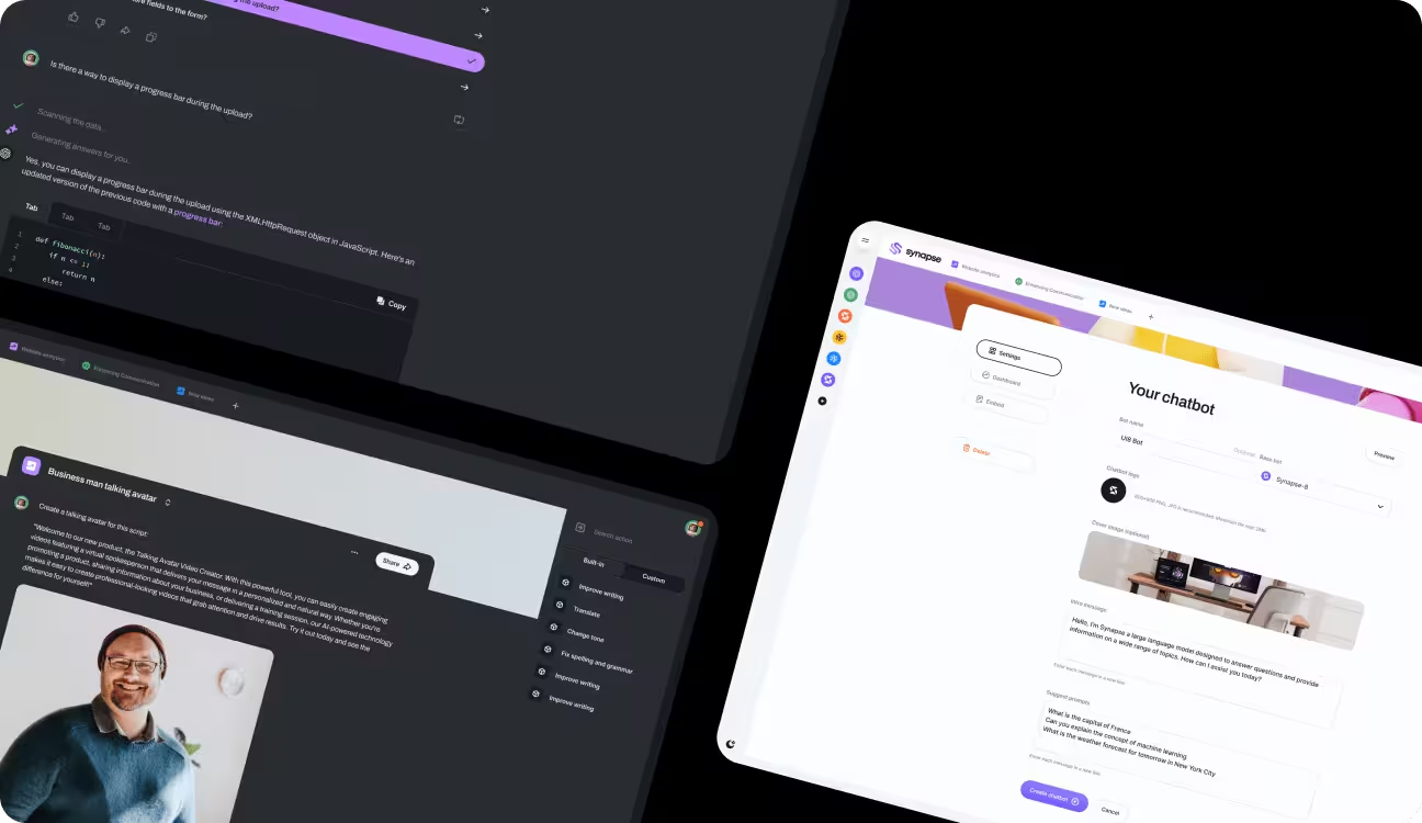
Shopify Homepage Redesign for a Premium Skincare Brand

Tags
- Fintech
- Business Management
- Dashboard
- Customer Services
Shopify Homepage Redesign for a Premium Skincare Brand
This concept project explores how a thoughtfully designed homepage can elevate brand perception and build trust for a premium skincare brand. Many beauty brands struggle to communicate credibility and differentiation despite having quality products. The goal of this project was to design a homepage that clearly conveyed value, reflected a premium identity, and guided first-time visitors toward confident purchase decisions.
The project focused on balancing aesthetics with clarity, ensuring the design felt refined without sacrificing usability or conversion intent.
Skincare
1.5 months


The Problem
The primary challenge was addressing the lack of trust and emotional connection often experienced by first-time visitors in the skincare space. Generic layouts, overcrowded sections, and unclear messaging can make premium products feel ordinary or untrustworthy. In this case, the homepage needed to communicate product value, ingredient integrity, and brand credibility within seconds, while avoiding an overly aggressive sales-driven tone.
The Approach
The approach centered on designing the homepage as a brand introduction rather than a traditional sales page. Priority was given to clarity, spacing, and content hierarchy to ensure visitors could easily understand the brand’s purpose and value within the first few scrolls. Messaging was structured to lead with brand story and credibility, followed by product benefits and supporting information, allowing users to build confidence organically. A mobile-first mindset guided layout decisions to maintain consistency and ease of navigation across all devices.

How this worked out
The process began by defining the ideal first-time visitor journey and mapping the information required to establish trust early. Content sections were sequenced to feel intentional and calm, with careful attention to typography, visual rhythm, and white space. Throughout the design phase, the layout was refined to reduce cognitive load and ensure that each section served a clear purpose without competing for attention.We offer insight into the unique methodology that drives our work at Synapse, illuminating the steps we take to turn ideas into reality and deliver innovative solutions that exceed expectations.
and
drag
Solution & Results
The final homepage design featured a clean, premium visual language supported by structured storytelling and subtle calls-to-action. Brand values, ingredient transparency, and product benefits were presented in a composed and approachable manner, helping visitors feel informed rather than pressured. The design was intended to increase time on site, strengthen brand credibility, and prepare users for higher-value purchasing decisions. This concept case study demonstrates how thoughtful homepage design can position a skincare brand as trustworthy and premium while supporting long-term conversion goals.


Our client’s speaks


