
Conversion-Focused Landing Page for E-commerce Scaling
Conversion-Focused Landing Page Redesign for a Sleep Device Brand
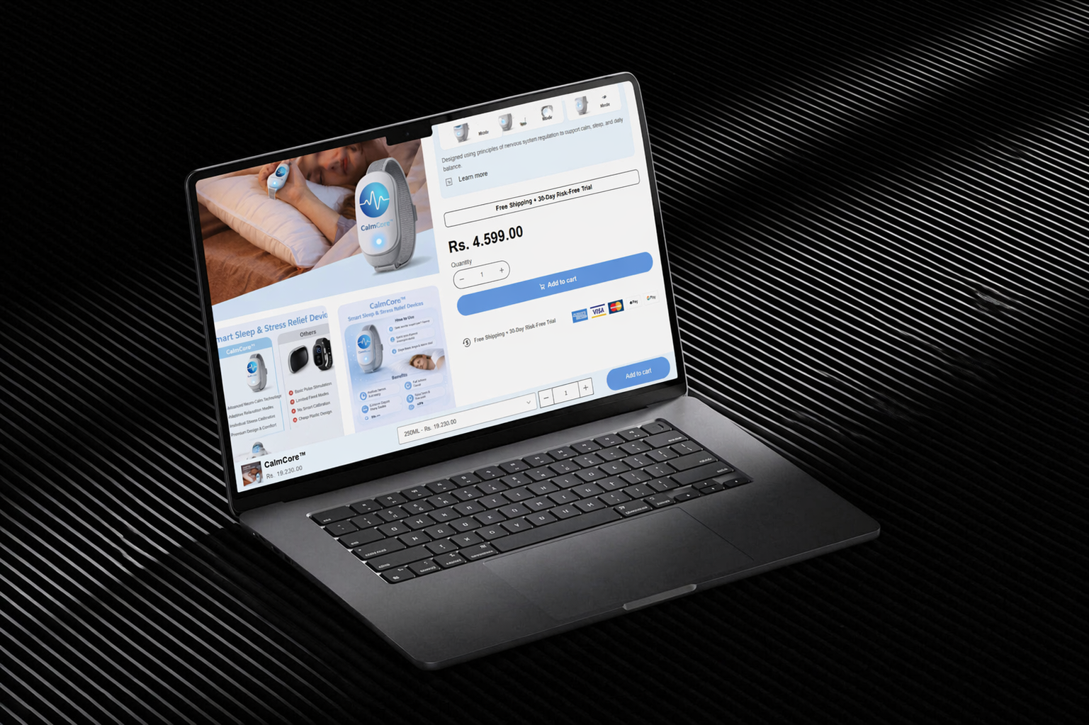
This project focused on redesigning a dedicated landing page for a sleep-focused wellness device (CalmCore) to support paid traffic and improve conversion consistency during scaling.
The brand was already generating traffic, but the existing page lacked the structure required to convert cold audiences efficiently. The goal was to rebuild the page as a focused conversion system that could handle increased ad spend without performance volatility.
Health & Wellness
1.5 weeks
The Problem
The issue wasn’t traffic – it was conversion stability.
For a product like a sleep device, where users are naturally skeptical (“Will this actually work?”), the existing page failed to build enough trust or explain the product mechanism clearly.
Key gaps included:
- Weak above-the-fold communication of the problem and outcome
- No clear explanation of how the device improves sleep
- Lack of proof elements near decision points
- Generic layout that didn’t address user hesitation
This made scaling difficult, as increased traffic amplified drop-offs instead of conversions.
Our Approach
The page was restructured around a problem → mechanism → proof → action framework.
Instead of presenting the product as a generic wellness item, the focus shifted to:
- Clearly articulating sleep – related pain points (restlessness, poor recovery, disrupted sleep cycles)
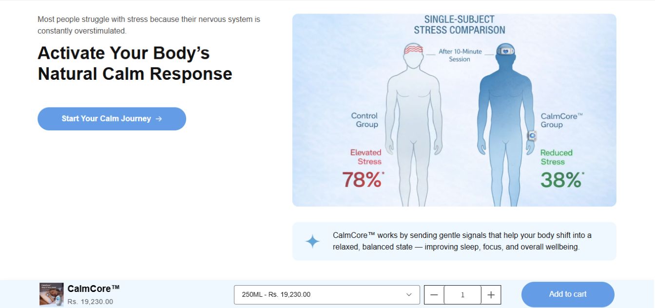
- Explaining how the device works in simple, digestible terms
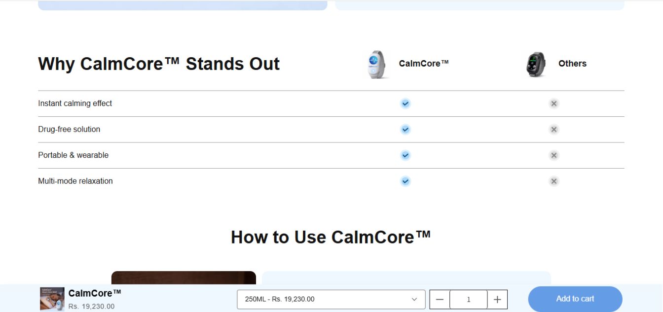
- Reducing skepticism through layered trust and validation
To improve both conversion rate and order value:
- Product bundles and multi-unit offers were introduced using a bundle-focused app
- Value anchoring was applied to position bundles as the default choice
- A simplified purchase path was maintained to avoid friction
How the Page Was Built
The redesign focused on aligning the page with real user decision behavior rather than visual preference.
Key implementation elements included:
- A revised hero section communicating a clear outcome-driven promise tied to better sleep
- A dedicated mechanism section explaining how the device works and why it’s effective
- Testimonials and user feedback placed strategically to reinforce credibility
- FAQ blocks addressing common objections (effectiveness, usage, suitability)
To strengthen conversion flow:
- Bundle options were embedded directly within the buying section
- Supporting apps were used to structure offers and present savings clearly
- Content sequencing was adjusted to ensure users encountered proof before being asked to commit
Early user interaction patterns (scroll behavior and section engagement) were used to refine content placement and reduce drop-off.
Solution & Results
The final landing page delivered a more structured and trust-driven experience, allowing users to quickly understand the product and make a confident decision.
As traffic scaled, the page showed more stable conversion behavior compared to the previous version. Instead of sharp performance drops with increased spend, campaigns were able to maintain consistency.
- Conversion quality improved due to clearer product understanding
- Bundled purchases contributed to higher average order value
- Paid campaigns stabilized, with top-performing ad sets operating in the – 1.9x – 2.3x ROAS range over time
The new structure allowed the brand to scale more predictably, without relying heavily on aggressive discounting.