Shopify Store Redesign for a Premium Skincare Brand
Shopify Store Redesign for a Premium Skincare Brand
This project involved redesigning an existing Shopify store for a premium skincare brand operating in a highly competitive market. While the brand had a solid product line and consistent traffic, overall revenue growth was limited by low average order value and an under-optimized purchase flow.
The objective was not just to improve the visual experience, but to restructure the store to increase AOV, strengthen purchase intent, and support more efficient paid traffic performance.
Skincare
1.5 months
The Problem
Despite strong products, the store was underperforming from a revenue perspective. Most customers were purchasing single products, and there was little incentive or guidance to explore higher-value combinations.
In the skincare category – where routines, ingredient trust, and long-term usage drive purchasing decisions – this created a major gap.
Key issues included:
- Low average order value due to single-product purchases
- Weak product page structure with limited cross-sell flow
- Lack of routine-based selling (products not positioned as a system)
- Homepage focused more on brand aesthetics than purchase direction
- Paid traffic converting inconsistently due to unclear value communication
The Approach
The redesign focused on turning the store into a structured buying system, rather than a browsing experience.
Instead of pushing individual products, the strategy emphasized:
- Routine-based selling (cleanse, treat, hydrate flows)
- Bundled product positioning to increase perceived value
- Clear product-role communication to help users understand how items work together
The goal was to guide users toward higher-value purchases naturally, without relying on aggressive discounting.
How this worked out
The process began by identifying where users were dropping off and why higher cart values were not being achieved.
Key implementation changes included:
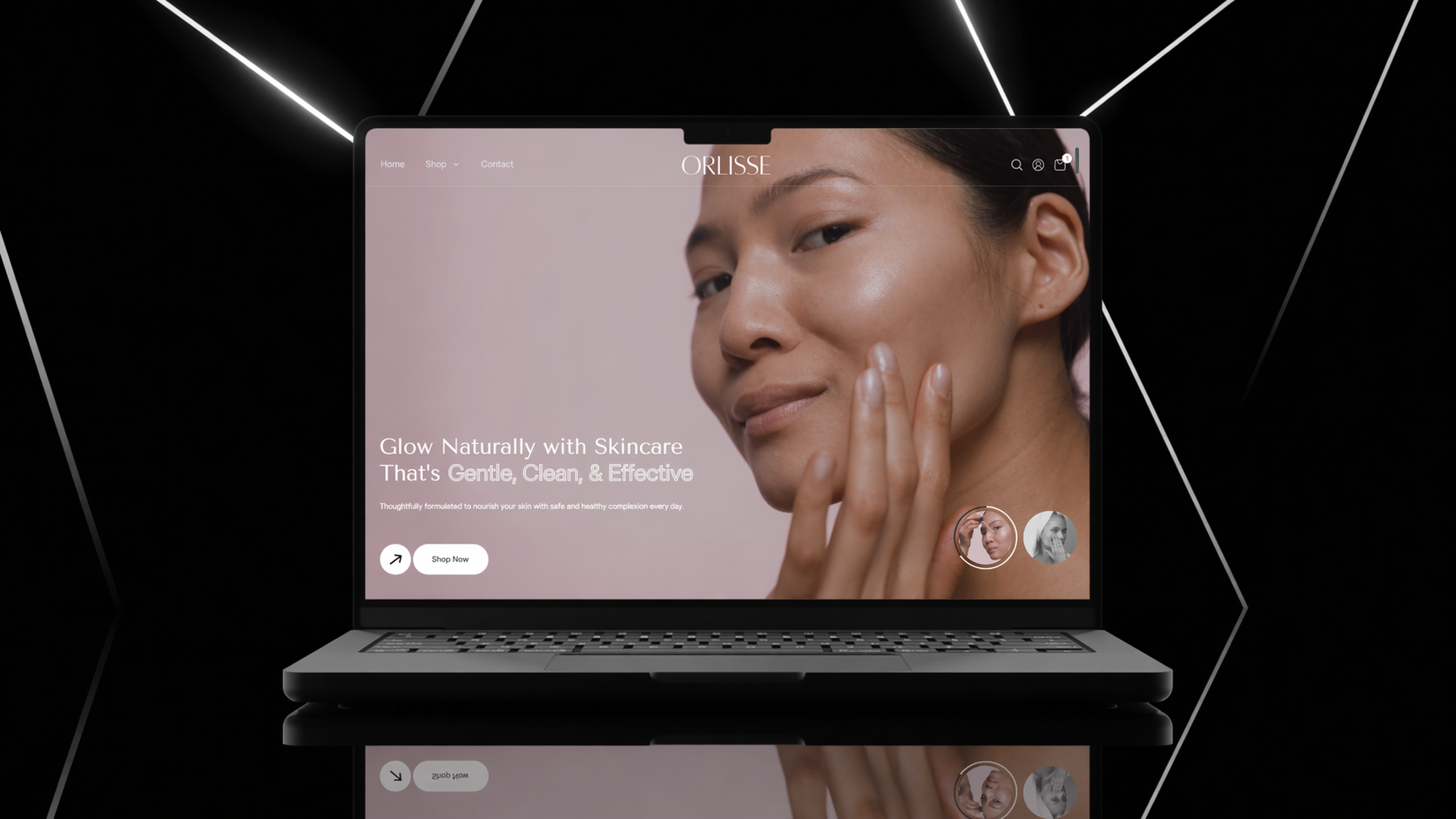
- Homepage restructuring to prioritize best-selling routines and curated product sets instead of generic browsing
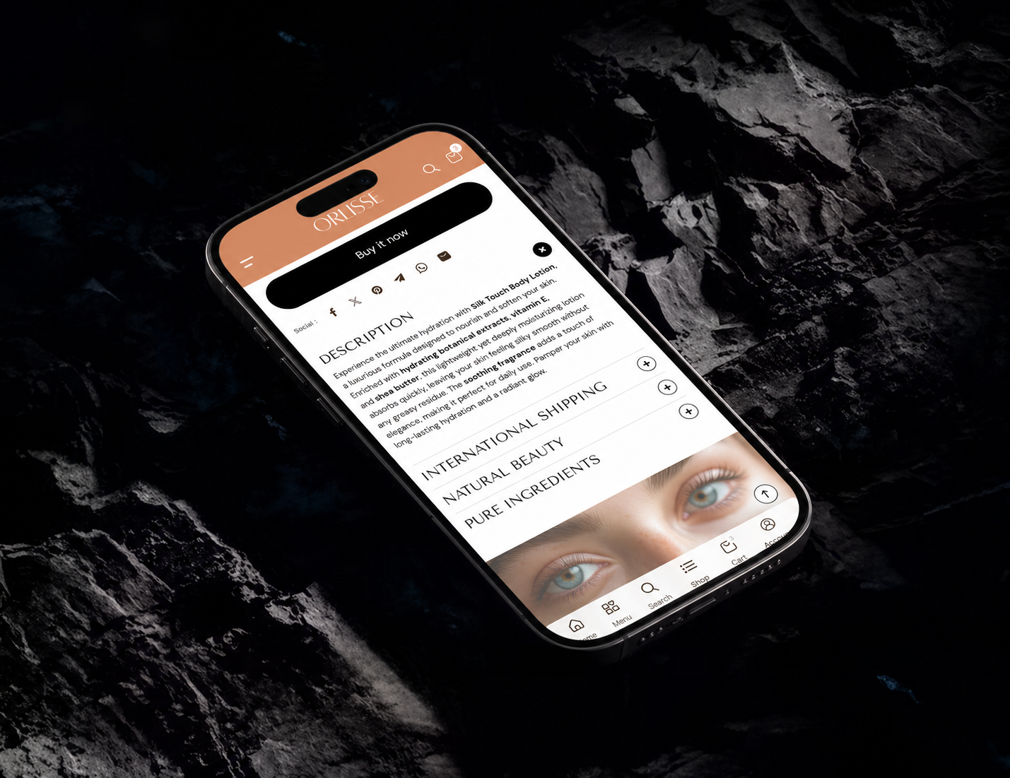
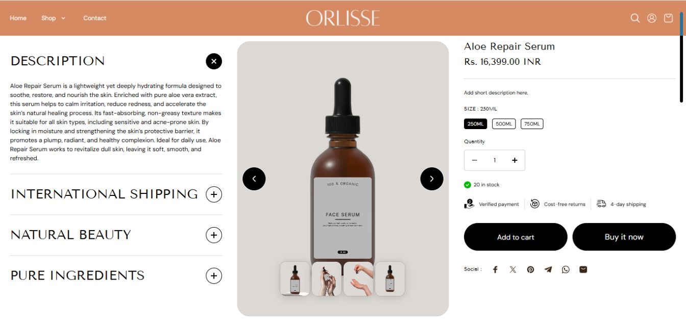
- Product page redesign with clearer benefit hierarchy, ingredient highlights, and “how to use” sections to reduce hesitation
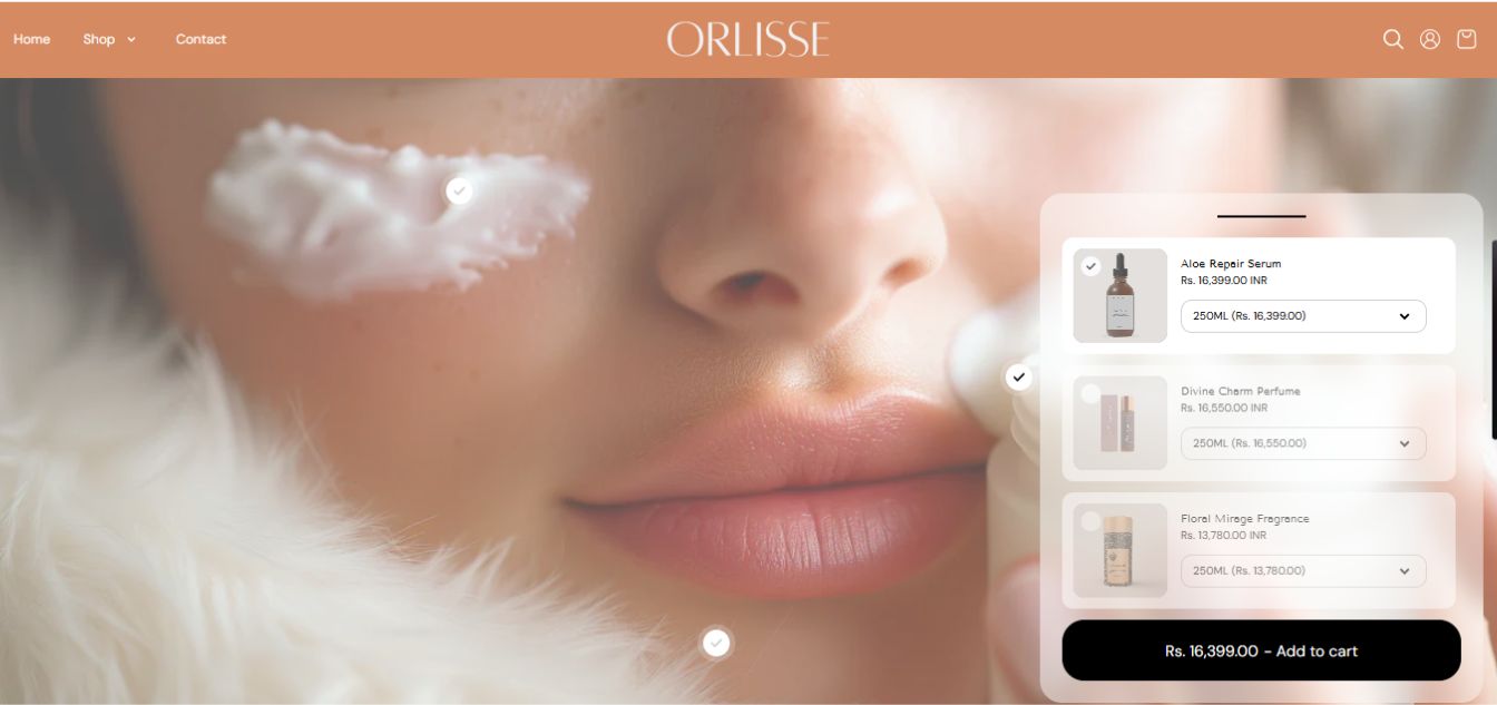
- Frequently bought together and bundle blocks integrated directly into the product page to encourage multi-product purchases
- “Shop the routine” / “complete your routine” sections to position products as part of a system rather than standalone items
To improve conversion behavior:
- Sticky add-to-cart was introduced for mobile users
- Trust elements (ingredient transparency, product clarity) were positioned closer to decision points
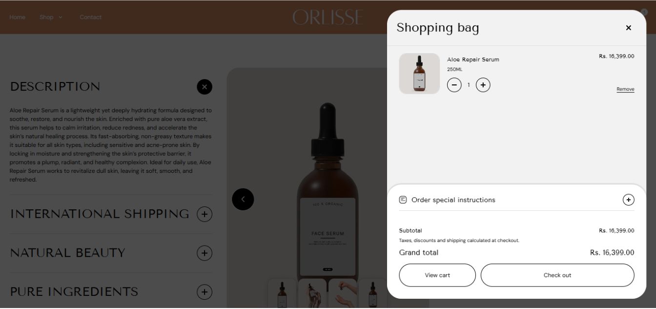
- Cart drawer was optimized with upsell suggestions to capture additional value at checkout stage
Changes were refined based on user interaction patterns such as scroll depth and engagement with key sections.
Solution & Results
The redesigned store created a more guided and conversion-focused buying experience, with stronger product positioning and clearer pathways to higher-value purchases.
Within the first few weeks post-launch, improvements were observed in how users interacted with product pages and bundles. As traffic stabilized, the store began to show more consistent performance across paid campaigns.
- Average order value increased due to higher adoption of bundles and multi-product purchases
- Product pages showed improved engagement and deeper scroll behavior
- Paid campaigns moved toward more stable performance, with top-performing ad sets operating in the – 1.8x – 2.3x ROAS range over time
The new structure allowed the brand to generate more revenue from the same traffic volume, reducing reliance on constant customer acquisition.