Posted by Debjit
in Web Design
in Web Design
Why Most Freelance Websites Fail in 2026 – And How to Fix Yours


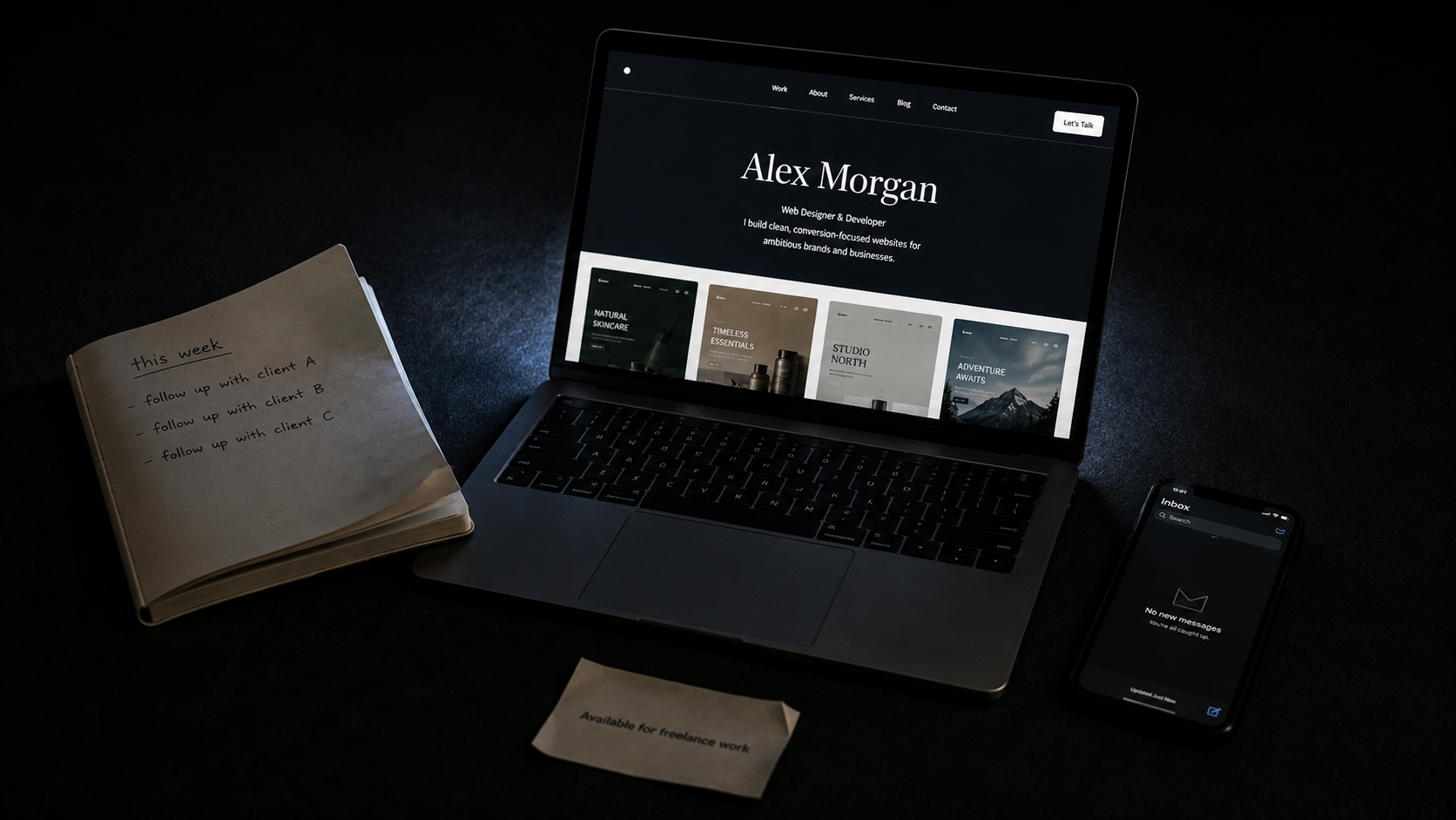
Why most freelance websites fail in 2026 is not a complicated question – once you understand what a freelance website is actually supposed to do.
Most freelancers build their website like a gallery. They upload their best work, write a short bio, add a contact form, and wait. The work looks good. The layout is clean. Everything is technically in order.
And then nothing happens.
No enquiries. No discovery calls. No leads. Just traffic that arrives, looks around, and quietly leaves.
Here’s the hard truth that most freelance advice dances around: your portfolio is your silent salesperson. And the number one mistake freelancers make is treating it like a gallery rather than a sales tool. Galleries display work. Portfolios sell services. Those are fundamentally different jobs and most portfolio websites are built for the first while desperately needing to accomplish the second.
This is a breakdown of exactly why freelance websites fail, with real examples of what failure looks like and what the freelancers who are genuinely converting visitors into clients are doing instead.
Most freelancers in 2026 are not thriving. They are surviving – and barely. Feast-or-famine cycles. Undercharging for work that exhausts them. Chasing clients who ghost them after three follow-up emails. Wondering quietly whether the whole thing was a mistake.
This is not a skill problem. The freelancers struggling in 2026 are often genuinely talented sometimes significantly more talented than those earning twice as much. It is a structural problem. A gap between being good at the craft and being good at running a freelance business. Most freelancers were trained to close the first gap. Nobody adequately explained the second one exists.
The website is where that gap shows up most visibly. Because the website is the one place where a potential client makes a decision about you entirely without your input. You’re not in the room. You can’t explain, charm, or clarify. The website either makes the case for you or it doesn’t.
And for most freelancers, it doesn’t.
Within five seconds of arriving on your website, visitors should understand three things: what you do, who you help, and why you are different. Most portfolios fail this test immediately.
They open with something like “I create beautiful digital experiences” or “Crafting meaningful design for purposeful brands.” These lines sound sophisticated. They communicate nothing. A potential client like a restaurant owner, a startup founder, a marketing manager lands on your homepage and cannot tell whether you design websites, logos, social media content, packaging, or interiors.
When visitors can’t understand what you do within seconds, they leave. Not because they’re not interested. Because confusion is the most powerful conversion killer that exists. People bounce from websites that require effort to understand and most freelance websites require significant effort to understand.
What fixing this looks like: Replace the poetic headline with a specific one. “I design websites for Indian D2C brands that need to convert better” communicates instantly. “I help restaurants turn their online presence into their best table” communicates instantly. “Web design for coaches and consultants who are ready to charge more” communicates instantly. The visitor knows if this is for them within two seconds of arrival. That’s the entire job of the hero section.
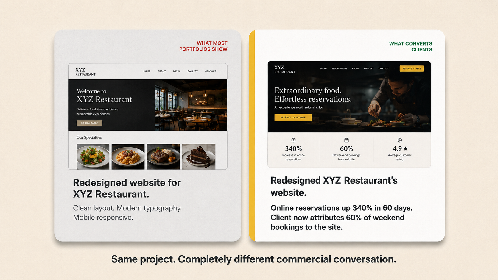
This is the most significant missed opportunity on almost every freelance website, and it costs freelancers more business than any design mistake ever could.
When a potential client looks at your portfolio, they’re not really asking “does this look good?” They’re asking “will hiring this person produce something that works for my business?” Those are different questions. And a gallery of beautiful screenshots answers the first while completely ignoring the second.
The freelancers landing the best clients in 2026 are not always the most talented. They are the ones whose work is easy to find, easy to trust, and easy to hire. And the easiest way to be easy to hire is to demonstrate that your work achieves something beyond looking good.
What a result-driven case study looks like: Not “Designed a new website for XYZ Restaurant.” Instead: “Redesigned XYZ Restaurant’s online presence – online reservations increased by 340% in the first two months. The client now attributes 60% of their weekend bookings to the website.” That is a completely different level of commercial communication. It transforms you from a person who makes things look nice into someone who solves business problems with design.
Real numbers. Real client language. Real before-and-after context. Clients are purchasing reliability and outcomes, not just talent. The portfolio needs to prove those outcomes exist.
When you try to target everyone, you attract no one. This is one of the oldest principles in marketing and one of the most consistently ignored by freelancers building their first and often second and third website.
A freelancer who designs “for businesses of all sizes across all industries” is, from a potential client’s perspective, a freelancer who has no particular expertise in anything. When a dental clinic owner is looking for a web designer, they will almost always choose someone who has designed for dental clinics before even if that person has less overall experience over a generalist with a decade of diverse work.
In 2026, you should be able to do many things, but your experience needs to be relevant to the clients you want to work with. Showing a dental client your entire portfolio including your fintech dashboards, your fashion brand identity work, and your restaurant menu designs doesn’t demonstrate versatility. It demonstrates a lack of focus. The client doesn’t care about your range. They care about their specific problem and whether you’ve solved it before.
The counterintuitive fix: Narrow down deliberately. Pick an industry or a type of project and build your entire website around that. Specialisation lets you charge significantly more, spend less time hunting clients, and position yourself as a brand rather than a commodity. A website that says “I design websites specifically for hospitality businesses in India” immediately eliminates competition from 90% of generalist designers because the client feels they’ve found someone who gets them.
Here’s something that will surprise you if you haven’t tracked it before: most freelance websites have no clear primary call to action. Or they have too many competing ones – “View My Work,” “Read My Blog,” “Follow Me on Instagram,” “Download My Rate Card,” “Send Me a Message.” The visitor arrives, looks around, and has no idea what they’re supposed to do next.
This is one of the clearest reasons why most freelance websites fail to convert – no single next step, no clear direction.
One hundred visitors with ten enquiries beats one thousand visitors with two. Conversion rate matters more than traffic especially for a freelance website where the primary goal is not browsing, it is initiating contact with a potential client.
What the highest-converting freelance websites do: One primary CTA. One action you want a visitor to take above everything else. For most freelancers, that should be “Book a Free Discovery Call” or “Tell Me About Your Project” – not “View My Work,” which sends visitors deeper into browsing mode rather than decision mode.
Place this CTA prominently in the hero section above the fold, visible without scrolling. Then repeat it at the bottom of every page. That’s the entire CTA strategy. Not a complex funnel. Just one clear next step, placed consistently everywhere.
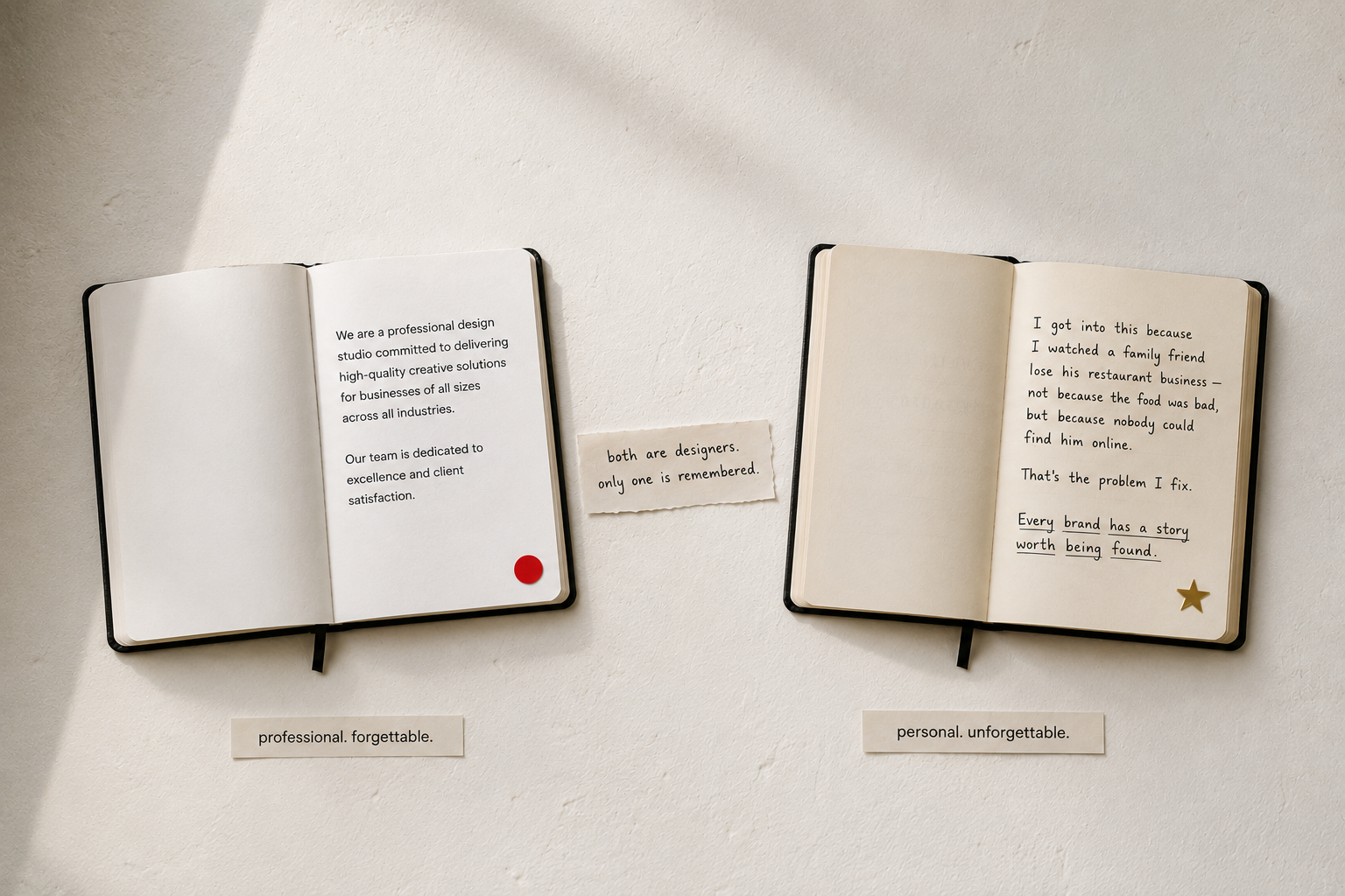
Many portfolios contain solid work but lack personality. There’s no “you” in them. They look like any other competent designer’s website – neutral, professional, and completely forgettable.
This matters more than most freelancers realise. Because at the point a potential client is deciding between you and another designer with similar work quality and similar pricing, they will choose the one who felt more human, more trustworthy, more like someone they actually want to work with for the next six weeks.
Your personality, your opinions, your way of describing what you do – these are differentiators that cannot be copied or commoditised. A freelance website that sounds like it was written by a committee, or worse, by a generic AI prompt, gives the potential client nothing to hold onto. They read it, feel nothing, and move on.
What adding “you” to a website looks like: A short paragraph in your own voice about why you specifically got into this work and what you specifically care about getting right. An opinion about bad web design that reveals your standards. A photo that looks like you, not a generic professional headshot that could be anyone. These small human signals create the feeling of “I want to work with this person” that no amount of polished design can manufacture.
Clients hire based on trust signals rather than skill claims. The claim “I create high-quality websites” is something every designer says. A client saying “Working with this designer transformed how we generate business online” is evidence.
Most freelancers either have no testimonials at all – waiting until their skills are “good enough” to start asking or they have testimonials so vague they carry no weight. “Great work, very professional, would recommend” tells a potential client almost nothing.
The testimonials that convert: Specific outcomes. Named people with roles and company names. Language about the experience of working with the freelancer – not just the quality of the output. “She delivered everything on time, explained every decision, and the site has already brought us three new corporate clients” is a testimonial that answers the exact questions a hesitant potential client is silently asking.
A solid portfolio with real results increases your chances of project success significantly and builds trust before the first conversation even happens. Start collecting specific testimonials from every completed project, even early ones. Ask the client directly: “Can you tell me one specific thing the website has achieved for your business since launch?”
This is the most ironic failure mode of all and the one that affects the most technically skilled freelancers specifically.
Designers build their portfolio websites to impress other designers. Clever micro interactions. Unusual scrolling effects. Typography choices that reference design history. These things are genuinely interesting to a designer. They are completely irrelevant to a restaurant owner, a startup founder, or an ecommerce business trying to find someone to build their site.
The freelancers who understand this distinction build websites for their clients, not their peers. Clear, fast-loading, easy to navigate, with work presented in a way that communicates value to a non-designer audience. A business owner does not care about your use of variable fonts. They care about whether the restaurant website you built started filling more tables.
The freelance websites generating consistent enquiries in 2026 share a specific set of characteristics and none of them are particularly glamorous.
They are specific about who they serve. They open with a clear, direct statement of value. They show results, not just work. They have one CTA repeated consistently. They have testimonials with specific outcomes and named clients. They load quickly on mobile. They sound like a real human being wrote them.
None of this is complicated. But it requires thinking about the website from the client’s perspective rather than the designer’s – which is the one shift that changes everything.
LinkedIn profiles with complete information receive 40% more opportunities. The same principle applies to your website: completeness, specificity, and clarity are what generate opportunities. The website that tries to be impressive converts worse than the website that tries to be useful.
Understanding why most freelance websites fail comes down to one shift thinking like a client, not a designer. Your website is the one conversation with a potential client that happens entirely without you. Make sure it says the right things – specifically, clearly, and in a voice that sounds like a person worth hiring.