Posted by Debjit
in Accessories
in Accessories

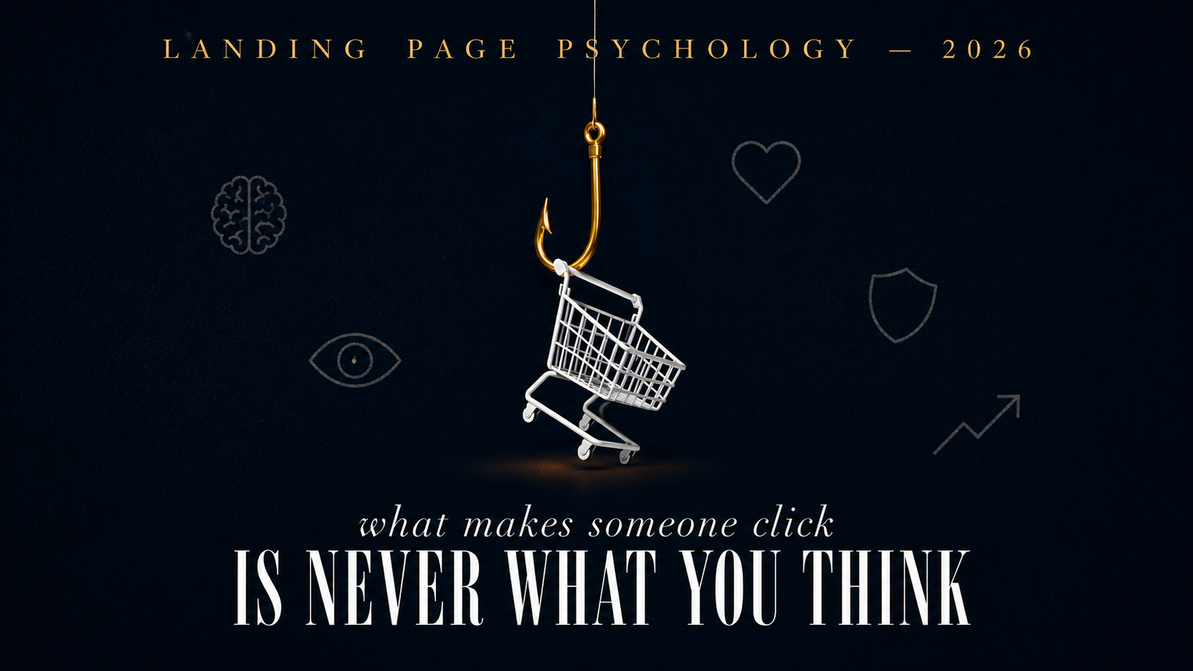
The psychology behind high-converting landing pages is the one thing most businesses never study and it’s exactly why most pages fail even when they look completely fine.
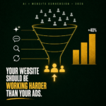
Here’s the gap that surprises people. The average landing page converts at around 4%. The top 10% convert at over 11%. That’s nearly a 3x difference and it almost never comes down to design quality. It comes down to understanding how people actually make decisions, and building your page around that reality.
People don’t buy logically. They buy emotionally and rationalize it afterwards. So your landing page’s job is not to present information. It’s to make someone feel safe enough, confident enough, and ready enough to take one specific action. Everything else is just decoration.
Something important has shifted in how visitors arrive at landing pages.
AI search tools – Google’s AI Mode, ChatGPT search, Perplexity – now answer research questions before users visit any website. The people who click through to your page have already compared options. They’re not browsing anymore. They’re evaluating.
This changes your landing page’s entire psychological job. You don’t need to convince them from scratch. You need to remove the remaining doubt and confirm a decision they’re already close to making.
Most landing pages are still built to educate. Most visitors arriving in 2026 need validation, not education. That mismatch quietly kills conversions every single day.
The Fogg Behaviour Model: developed at Stanford says three things must align for someone to act: motivation, ability, and a trigger. Most pages nail the trigger (the CTA button) and neglect the other two.
Motivation means giving people a clear reason to act. Ability means making the action feel effortless. Trigger means the button at the right moment. Remove any one and the conversion stalls.
Research shows pages with a single focused call to action convert up to 3x better than pages with multiple competing options. Decision fatigue is a documented psychological phenomenon – the more choices you offer, the higher the chance of no decision at all.
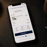
What Shopify does and why it works:
Visit their pricing page. One plan is labelled “Most Popular.” Each option tells you exactly who it’s for solo entrepreneur, small team, growing business. You don’t need to compare feature lists. The page already tells you which one is yours.
This is motivation and ability engineered into layout. The CTA is just the trigger. The real conversion work is done before the button even appears. Shopify grew to power over 4 million merchants globally and this kind of clarity-first design has been central to their onboarding conversion from day one.
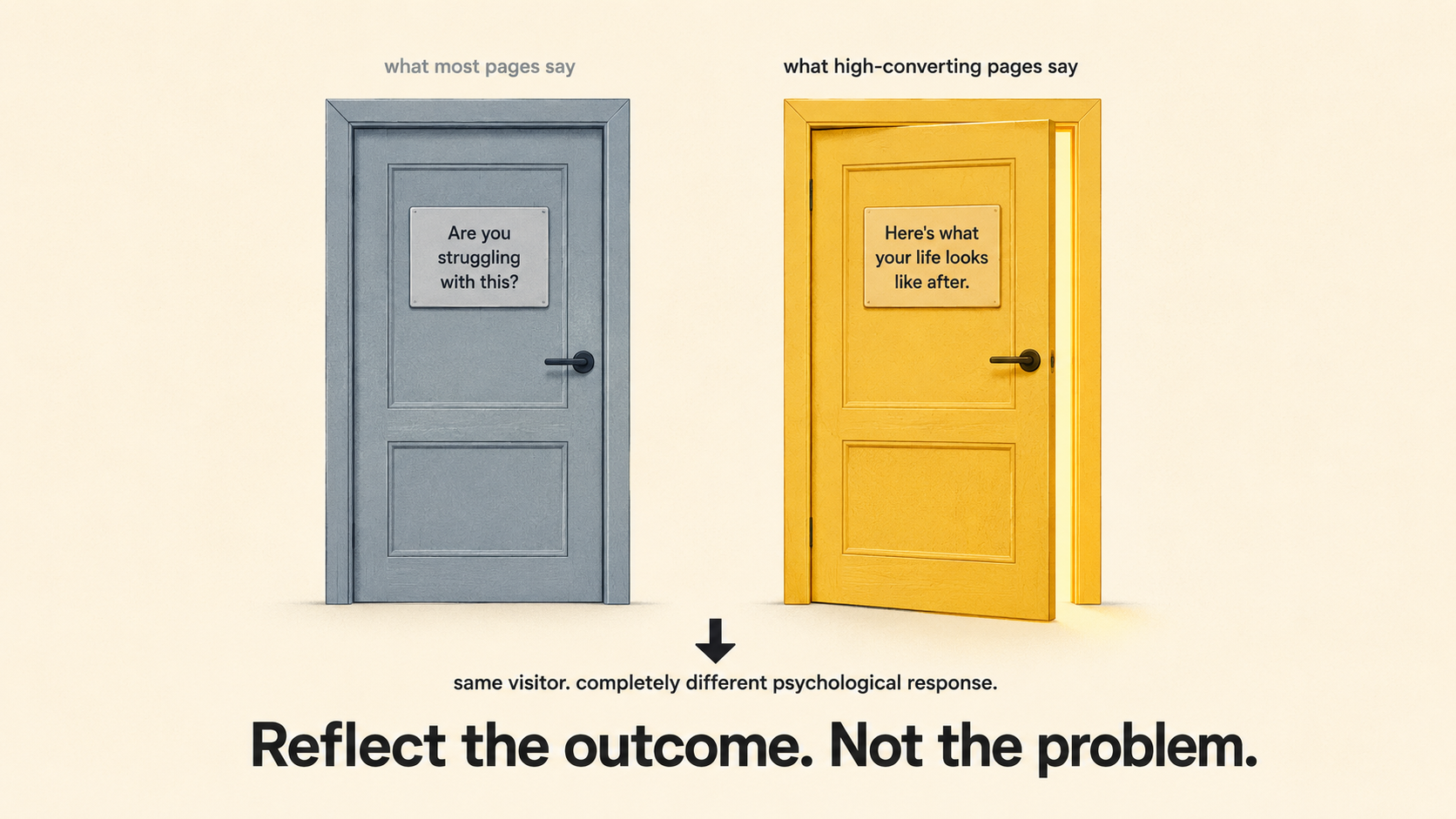
When someone has a sensitive or painful problem, announcing their pain back at them doesn’t convert. It triggers defensiveness. Showing them the outcome they want and letting them connect the dots does.
What Hims does and why it works:
Hims sells treatments for hair loss and men’s health conditions that carry real social stigma. Their conversion challenge is significant: they need to engage visitors who are simultaneously interested in the solution and uncomfortable acknowledging the problem exists.
Their approach: the headline leads with the outcome “Thicker, fuller hair” not with “struggling with hair loss?” That phrasing would trigger immediate defensiveness. Visitors can engage with the aspiration without having to admit the problem out loud, even to themselves.
Then comes the quiz. Rather than asking visitors to buy immediately – a high-commitment ask that raises psychological resistance Hims guides them through a short intake form to find the right treatment. This is a micro-commitment mechanic: a small, low-friction first action that builds investment and momentum toward the larger one.
The data supports this approach. Quiz-based lead capture converts at an average of 40.1% – meaning four in ten people who start a quiz become leads. Compare that to a standard contact form. The difference isn’t the quiz itself. It’s the psychological commitment the quiz creates. Someone who has answered four questions about their situation feels invested. They follow through at significantly higher rates than someone who just landed on a static page.
The result: Hims grew from a niche men’s health startup to a brand with over 1.7 million subscribers and a revenue trajectory approaching $1 billion, built heavily on this consultation-first, outcome-led conversion model.
This is one of the most consistently proven findings across conversion research. Show your landing page to someone with no context. Give them five seconds. Ask them what you do.
If they get it wrong that clarity problem is costing you conversions before anyone reads anything else.
Research from the Nielsen Norman Group on how users read web pages shows people scan, not read. They make quick judgments based on the first headline and the first visual. If both are vague or clever rather than clear, they leave. The brain interprets unclear information as a signal to distrust not as an invitation to dig deeper.
“We help small businesses get more clients online” will always outperform “Supercharging your digital growth journey.” Not because one is more creative. Because one is understood in under a second.
The practical rule: your e-commerce page should look like an e-commerce page. Your service page should feel like a service page. Matching visitor expectations lowers cognitive load. Breaking them raises it. And raised cognitive load means lower conversion every time.
Pages with a single link convert at around 13.5% on average – pages with five or more links convert at around 10.5%. That 3% gap represents real revenue, lost to navigation menus and footer links that nobody asked to be there.
Every link on a landing page is an exit from the conversion path. When someone arrives from an ad or email, they followed a specific intent. A navigation menu offers them twelve other places to go. Most of them will take one.
What Gymshark does and why it works:
Gymshark’s conversion strategy is built on creating urgency and eliminating hesitation not through aggressive sales tactics, but through deliberate scarcity and community psychology. Their limited-edition drops are engineered around FOMO (fear of missing out). Products are released in short windows, influenced by athletes with dedicated followings, and communicated through SMS and email with near-100% open rates. The scarcity is real items genuinely sell out.
The Gymshark66 challenge generated 1.1 million Instagram posts and 65.7 million TikTok engagements. Repeat purchase rates among community members rose 30%. Revenue hit £607 million for FY2024. This isn’t just good marketing – it’s the psychology of belonging applied to commerce. When your customers feel part of something, they don’t need to be persuaded to buy. They want to participate.
Their strategy shows that conversion doesn’t only happen on a landing page. It’s built upstream through community, trust, and emotional investment so that by the time someone reaches the page, the decision is already close to made.
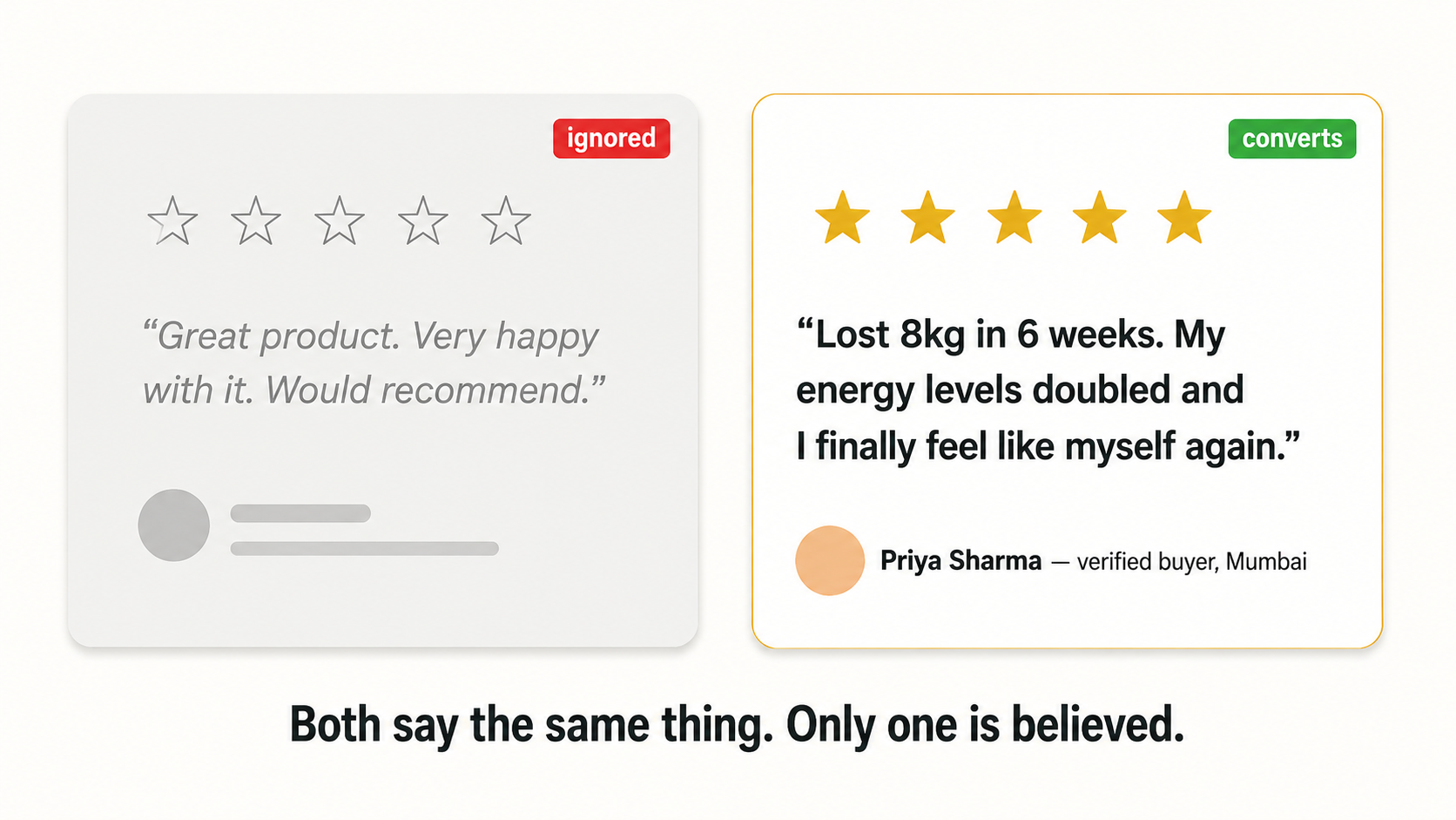
“Thousands of happy customers” is invisible. “I lost 8kg in 6 weeks and my energy levels doubled” is evidence.
The specificity is the psychology. Vague testimonials are processed as noise. Specific ones with real names, real photos, and measurable outcomes are processed as proof.
Social proof elements increase landing page conversions by 34% when placed strategically. Placement matters as much as content. Put testimonials mid-page — after your product explanation but before the final CTA. That’s the psychological moment when doubt is highest. That’s when evidence does its most important work.
What Hers does and why it works:
Hers, the women’s counterpart to Hims, faces the same challenge of converting visitors dealing with sensitive health concerns. Their approach: pricing transparency shown upfront (“Starting at $199/month”) before anyone asks. Before-and-after photos positioned mid-page — not buried at the bottom as an afterthought, but placed at exactly the moment the visitor is silently asking “does this actually work?”
That timing is deliberate and psychologically precise. Trust signals work best at the moment of peak doubt, not before visitors understand the offer, and not after they’ve already made up their mind. Hers targets that moment directly.
What Nykaa does and why it works:
Nykaa’s product pages lead with transformation, a before-and-after, or a specific customer result before the star rating reinforces it. Most brands reverse this. They lead with “4.7 stars” and then show the testimonial.
Nykaa’s sequence is more psychologically effective: the transformation story builds emotional resonance first. The rating then validates what the story already established. The visitor bonds with the person in the story before the data confirms it. That sequence converts better because confirmation lands harder than introduction.
83% of traffic comes from mobile. But desktop converts at 4.8 to 5% on average while mobile sits at 2.49 to 2.9%. That 40% gap is not a device problem. It is a friction problem.
Mobile visitors face the same psychological barriers – uncertainty, the need for trust, the desire for clarity but on a smaller screen, with a thumb, often while doing something else simultaneously. Every friction point that a desktop user might tolerate becomes a conversion exit on mobile.
Three-field forms convert 25% better than nine-field forms. Phone number fields reduce conversion by 5% on average when required. Captcha challenges reduce conversion by 3.2%.
These numbers are not abstractions. They represent real visitors who started a form, hit a friction point, and left. The solution is not better design. It is fewer asks, larger tap targets, and payment options that remove the highest-anxiety moment in any mobile purchase entering card details.
Message match. The psychological continuity between what brought someone to your page and what they find when they arrive.
When the ad said “50% off vitamin C serum” and the landing page opens on your generic homepage, the psychological thread is broken. The visitor expected somewhere specific. They arrived somewhere general. That dissonance triggers immediate exit behavior.
38% of businesses still use their homepage as a landing page for paid traffic. If you’re doing this, you’re paying to acquire attention and then immediately removing the context that made the click meaningful.
Dedicated landing pages outperform homepages for paid traffic every time – not because homepages are bad, but because homepages are built for everyone. Landing pages are built for one person, from one specific place, with one specific intention. That specificity is the psychology. The conversion follows from it.