Posted by Debjit
in Accessories
in Accessories
What Makes People Trust a Website Instantly? The Honest Breakdown for 2026

What makes people trust a website instantly? It’s a question most businesses get wrong because they’re answering it with logic when the real answer is almost entirely emotional.
Here’s the number that should stop you: visitors form an impression of your website in about 0.25 seconds. Not three seconds. Not five. A quarter of a second – faster than you can finish reading this sentence out loud. In that sliver of time, before anyone reads a single word of your copy, their brain has already made a decision: does this feel legit, or doesn’t it?
Everything that happens after that first quarter-second is just confirmation. Either you’ve already lost them, or you’ve earned a few more seconds to make your case.
So let’s actually talk about what’s happening in that quarter-second and what the smartest brands are doing about it.
For years, the trust-building playbook was simple. Clean design, a security padlock, maybe a few client logos at the bottom of the page. That used to be enough to get the benefit of the doubt.
It isn’t anymore. The average consumer has developed a sophisticated immunity to traditional trust signals – because we’ve all been burned. We’ve all bought a highly-rated product that disappointed us. We’ve all visited a sleek, professional-looking website that belonged to a company that turned out to be a scam. That repeated exposure to polished fakeness has quietly rewired how people evaluate trust online.
In 2026, buyers don’t want you to tell them you’re trustworthy. They want proof that bypasses their skepticism entirely. And that’s a much higher bar than it used to be.
Stanford’s web credibility research found something that surprises most business owners: people judge a website’s trustworthiness mainly by its visual design and layout not its content. If your site looks sloppy, visitors subconsciously assume your business is sloppy too. Fair or not, that’s how the brain works.
This happens before anyone reads anything. Spacing, typography consistency, load speed, whether the layout feels intentional or thrown together all of it gets processed instantly, beneath conscious thought.
A real example worth studying – Razorpay: India’s leading payments company has built one of the cleanest, most restrained homepages in Indian B2B tech. No clutter. Generous white space. A single clear headline. Every section breathes. For a company whose entire business is convincing other businesses to trust them with payment infrastructure, this isn’t a design choice – it’s the product itself, communicated visually before a single feature is explained. The visual calm signals operational calm. That association is doing real commercial work.
Compare that to a website with five competing fonts, inconsistent button styles, and cramped spacing. Even if the underlying business is completely legitimate, the visual chaos creates a subconscious association with chaos in how the business operates. You don’t get to explain that away with good copy. The first impression has already happened.
This is where most advice gets vague. Let’s not do that. Here’s what the data actually shows, broken down by the specific signal.
Customer reviews – the single biggest lever available. 93% of consumers check reviews before purchasing, and 88% trust online reviews as much as a personal recommendation from a friend. There’s a specific threshold worth knowing: consumers need to see at least 10 reviews before they start trusting a business. A page with two reviews even both five stars creates more doubt than a page with 47 reviews averaging 4.3 stars. Volume itself is a trust signal, independent of the rating.
Photos in reviews matter more than people realize. Reviews that include photos increase trust by 38% compared to text-only reviews. This is why brands like Nykaa actively prompt customers to upload photos with their reviews – a real face or a real product-in-use shot is far harder to fake than a sentence of text, and visitors know it instinctively.
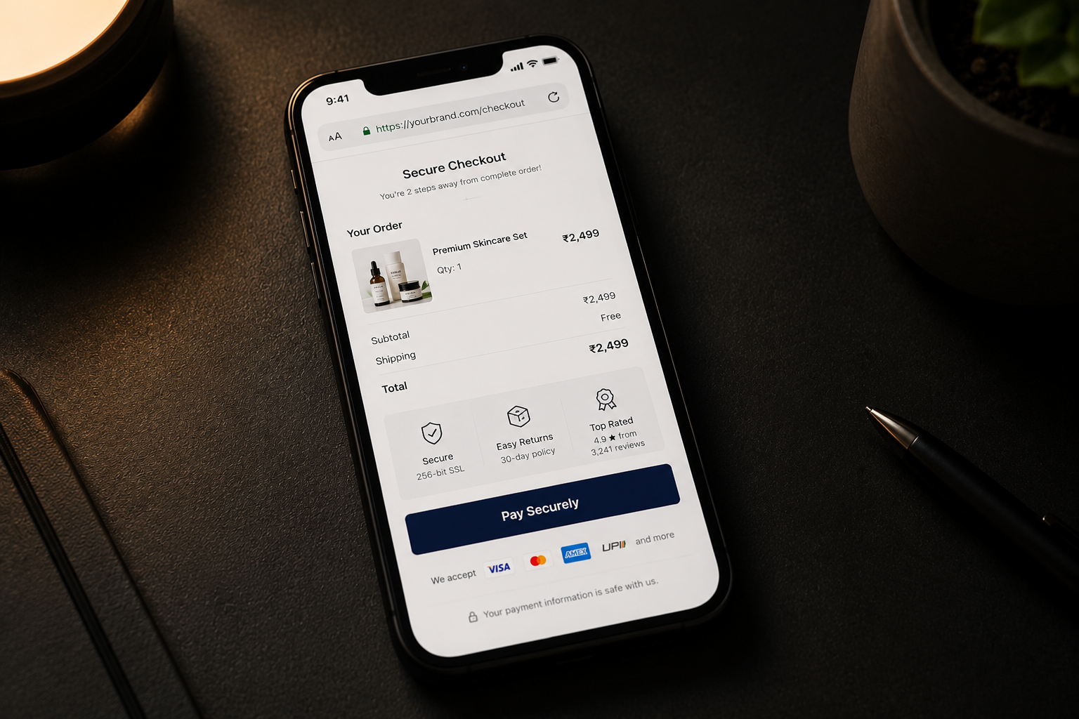
Security and pricing transparency at checkout. Hidden fees are the number one reason carts get abandoned – the Baymard Institute estimates this contributes to roughly 70% of all abandoned carts. Showing full costs upfront base price, shipping, taxes before the customer reaches the final screen isn’t just honest. It’s a measurable trust and conversion lever.
Money-back guarantees. A visible guarantee near the price or CTA addresses the exact risk concern a hesitant buyer is silently calculating. This single element has been shown to lift conversion by around 21% in documented implementations because it answers the unspoken question “what happens if this doesn’t work for me?” before the visitor has to ask it.
Support accessibility. Brands that make a live chat or support widget visible and instantly reachable without forcing visitors to hunt for contact details or fill out a form first remove friction at the exact moment doubt appears. This is part of why support-led brands consistently outperform on trust metrics: accessibility itself is read as a sign of confidence.
Here’s a genuinely counterintuitive insight from 2026 research that deserves more attention than it gets.
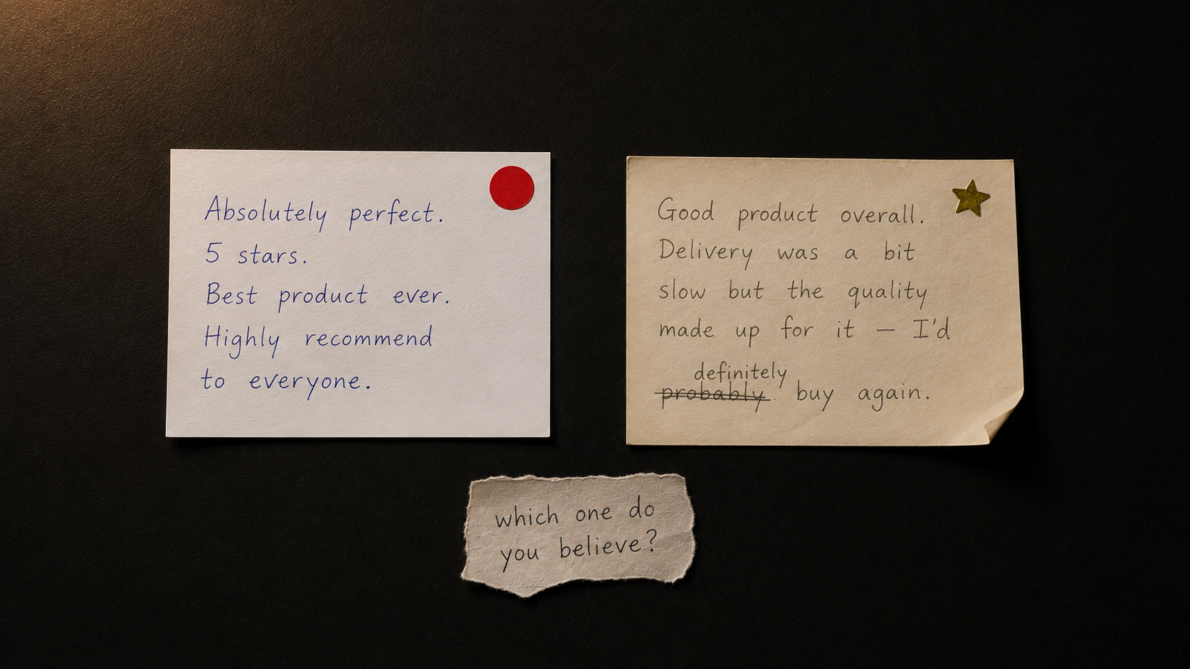
When social proof appears too curated and polished, it loses power. Marketers love to cherry-pick the most glowing five-star testimonials and display them like trophies. But buyers have learned to recognize that pattern and recognizing it triggers skepticism. If every single review is glowing, visitors assume you’re hiding the negative ones. They wonder what isn’t being shown.
The brands earning the most trust in 2026 are doing something almost nobody else is willing to do: showing the occasional three-star review, or a critical comment with a genuine, transparent response underneath it. Roughly 41% of consumers specifically read how a business responds to negative reviews and a thoughtful response to criticism often builds more trust than ten perfect five-star reviews ever could.
This is uncomfortable advice because it goes against every marketing instinct to present only the best version of yourself. But the data is clear: imperfection presented honestly converts better than perfection presented suspiciously.
This statistic deserves its own section because it settles an argument a lot of small business owners are having right now.
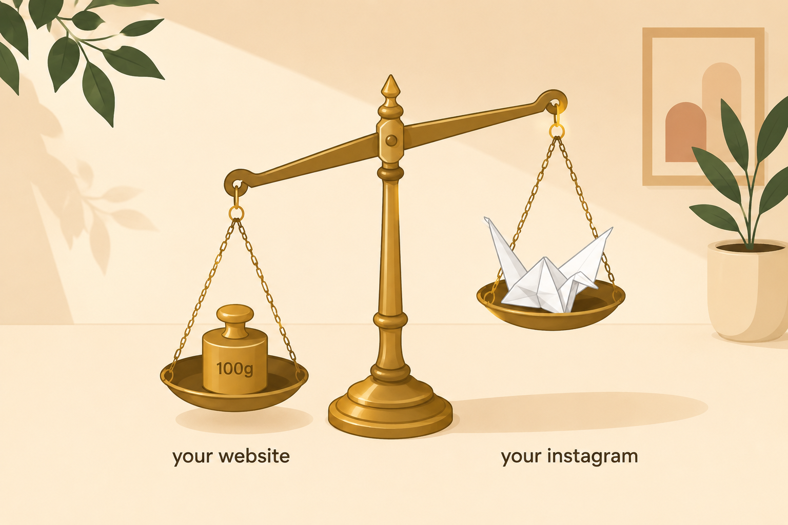
DreamHost’s 2026 Local Business Trust Index found that businesses with a website are perceived as 41% more trustworthy than businesses without one making a website the single strongest credibility signal outside of online reviews. Even more telling: consumers are comfortable spending an average of $177 on a business website, but only $36 on an Instagram or TikTok shop. For purchases over $100, people are seven times more comfortable buying through a website than through social media.
This matters enormously for small businesses tempted to skip a proper website and rely purely on an Instagram bio with “DM for pricing.” Social media is excellent for discovery. It is not where people feel safe spending real money. A potential customer who finds a beautiful handcrafted product on Instagram but can’t find a website, transparent pricing, or a real checkout will frequently choose a less interesting competitor who has those things simply because the absence of a website itself reads as a risk signal.
Here’s the part of this conversation that almost nobody connects, and it matters more every month.
The same trust signals that convince a human visitor also determine whether AI search tools – Google’s AI Mode, ChatGPT, Perplexity will cite your website in their answers. A 2026 study analysing 1,000 enterprise brands found that 62% were invisible to generative AI models despite heavy investment in traditional SEO. The reason wasn’t bad content. It was a lack of verifiable trust signals consistent business information, backlinks from credible sources, transparent authorship, and technical health.
Research from Ahrefs shows a strong correlation between branded mentions in authoritative publications and inclusion in AI-generated answers. This means every trust signal you build for human visitors consistent business details, genuine reviews, secure technical infrastructure, transparent “About” information is doing double duty in 2026. It’s earning human trust and AI citation simultaneously.
Knowing the principles is one thing. Seeing where your specific website fails to build trust is another and this is where AI-powered tools genuinely earn their place in your workflow.
Microsoft Clarity – Free, and remarkably good at this specific job. Its AI-powered session analysis flags rage clicks and dead clicks – the exact moments visitors get confused or frustrated. If people are rage-clicking near your pricing section or your “About” page, that’s a trust breakdown happening in real time, not a guess.
Lucky Orange – Combines heatmaps with AI analysis that explains, in plain language, what the data means. It will flag specific things like “move testimonials higher to increase trust before the CTA” – turning raw behavioral data into a direct, actionable trust recommendation.
Ahrefs Site Audit – Detects over 100 technical issues that quietly damage trust – broken links, missing HTTPS, slow load times, mixed content warnings. Google has confirmed HTTPS as a direct ranking factor, and browsers actively flag non-secure pages – a visible red flag that kills trust before a visitor even reaches your homepage content.
Google PageSpeed Insights – Free and essential. Trust and speed are linked more tightly than most people realize – a slow-loading site feels broken, and a broken-feeling site feels untrustworthy, regardless of how good the actual business behind it is.
A few final, specific things worth checking on your own website right now because they’re the kind of issue that doesn’t get noticed consciously but absolutely gets felt.
Mismatched business information across platforms. If your business name, address, or phone number is listed differently on your website than on Google Business Profile or Facebook, it creates a subtle friction that registers as “something’s not quite right” – even if the visitor can’t articulate why.
Layout shift while loading. Buttons or images that jump around as a page loads feel broken and broken reads as untrustworthy, even to visitors who have no technical understanding of why it’s happening.
No visible way to contact a real human. A contact form with no phone number, no email, and no address creates hesitation. Multiple, easy-to-find contact methods reduce buyer anxiety significantly – because reachability itself is read as a proxy for legitimacy.
Each of these feels small in isolation. Stacked together across a single visit, they compound into the overall feeling of “I’m not sure about this” which is the single most common reason a visitor leaves without converting, even when they were genuinely interested in what you offer.